bauhaus - mask

type
packaging
branding
roles
packaging
illustration
ui ux
client
uni project
date
2022
problem
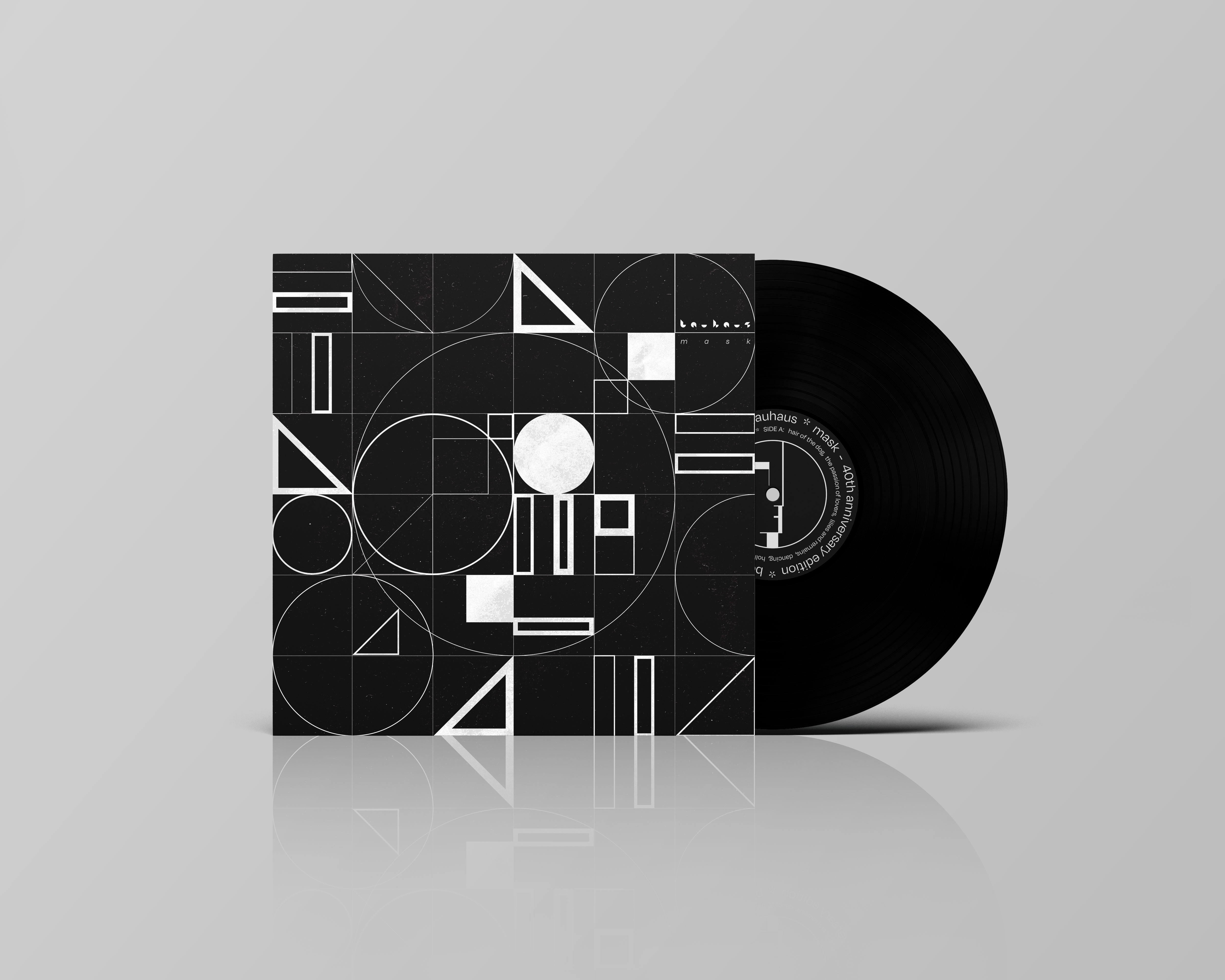
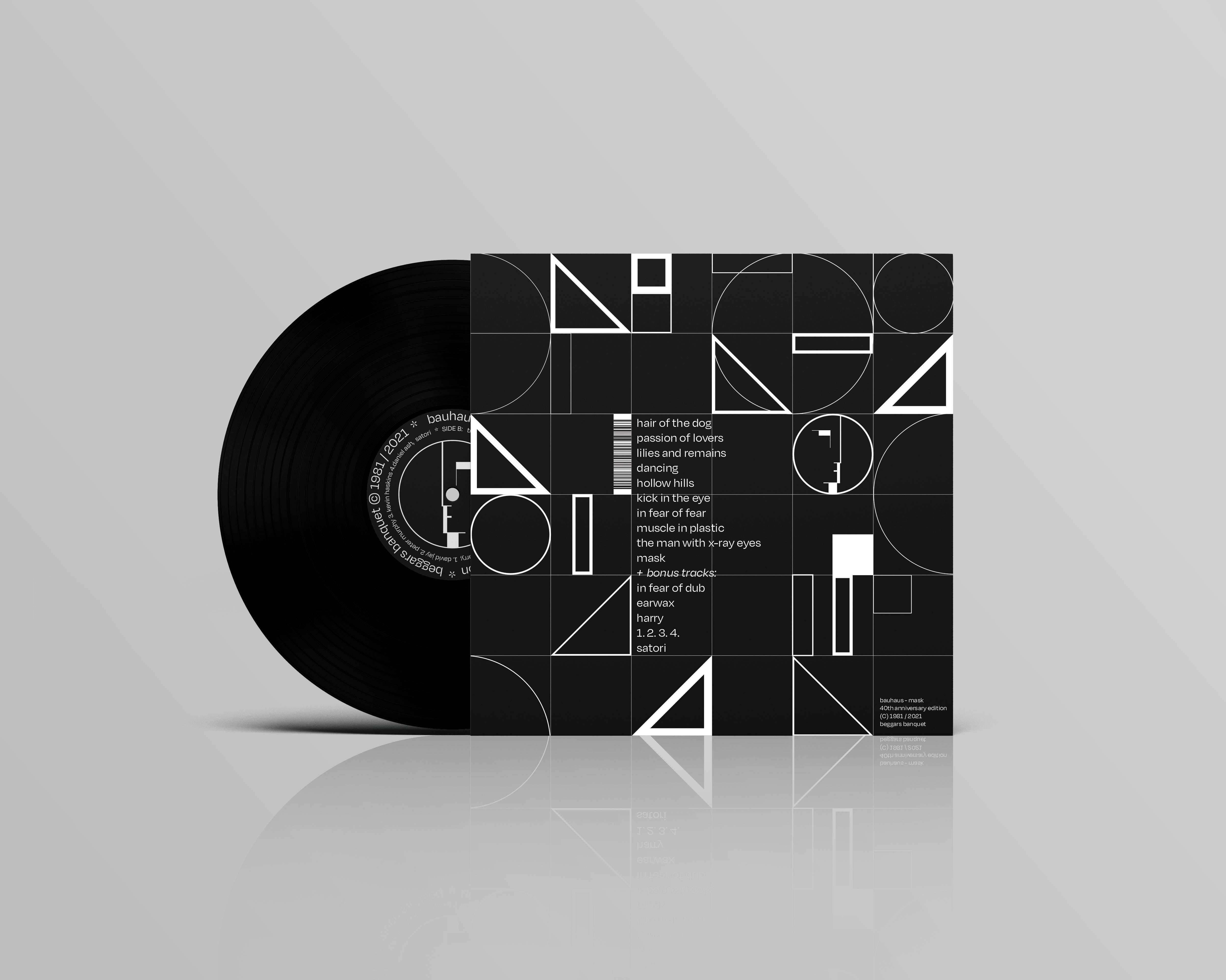
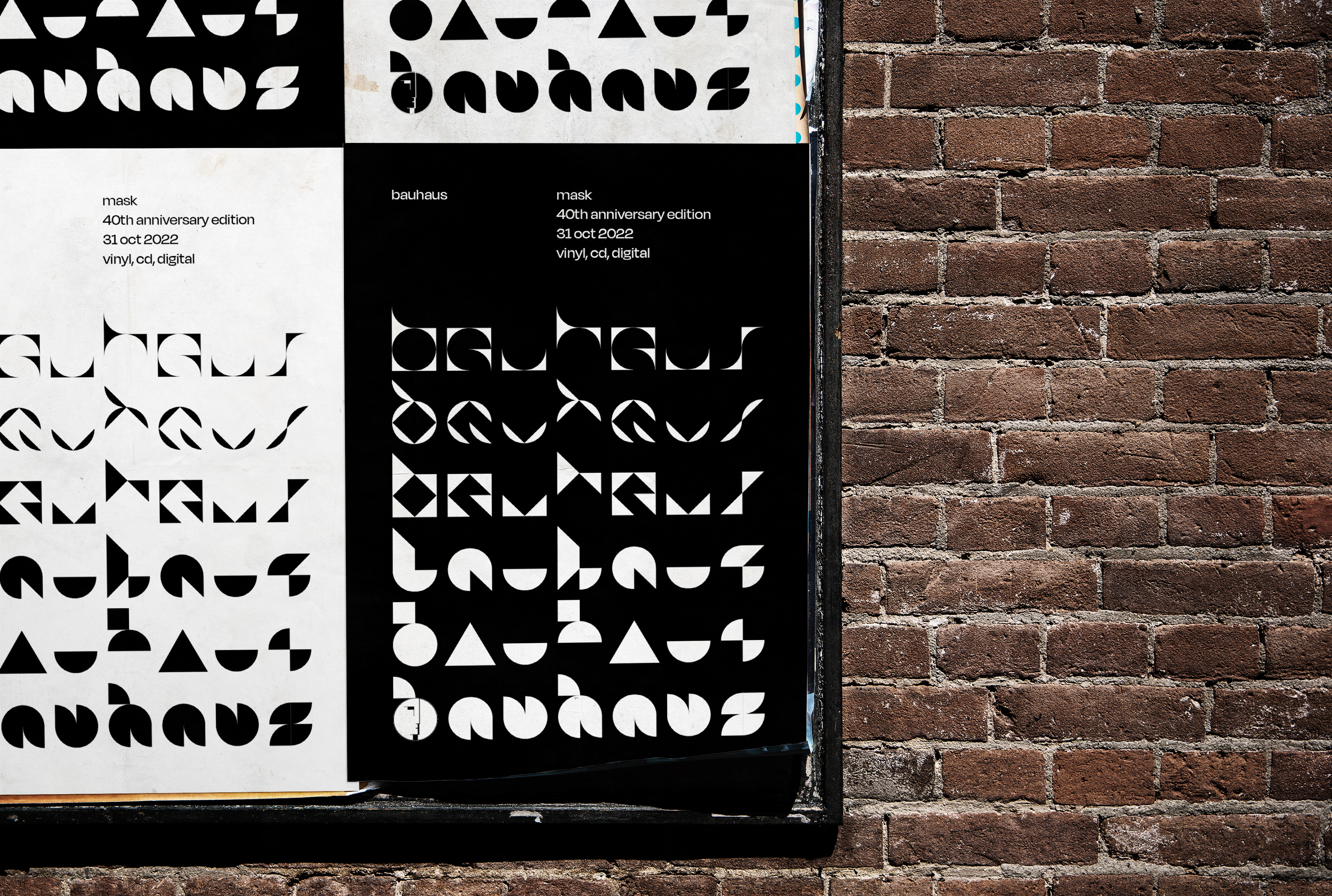
bauhaus are the pioneers of the goth-rock sound, and made waves back in the early 80s with their inventive sound. 'mask' (1981), is the band's sophomore release, evolving and developing on their sound from the first record, going from a more serious and dark tone in the first to a cavalier and morbid one.
40 years has passed since its initial release, making it the perfect time for a visual reimagining. not limited to the record, but also the band's branding and style.
solution
the original artwork featured a drawing by guitarist Daniel ash, depicting various masked figures through a charcoal medium. this artwork while great in it's own right was often thought to be a mismatch to the sound of the record.
my solution takes the idea of the bauhaus school of design and their principles, and combines it with the dark macabre aura of the band. this idea is the basis for the entire branding strategy as well.
back to top